The Problem
Your team has just received a large volume of transactional customer data from a client at the start of a new project. Product descriptions are inconsistent, duplicate invoices are scattered throughout, and rebates sit alongside genuine revenue lines. The deliverable is a clean, categorised revenue map split by product category over time, ready for the engagement manager.
Manually, that means hours of sorting, deduplicating, building a product-to-category mapping key, and cross-referencing lookups before you can run a single piece of analysis. It's exactly the kind of repetitive, low-value grunt work that AI for Excel was built to eliminate.
The Solution
With Tracelight's AI for financial modelling in Excel, you can massively accelerate this entire process with a few prompts. Instead of spending half a day wrangling raw data, Tracelight works directly in your spreadsheet to clean, categorise, and structure your data so you can get to the actual analysis faster.
Step 1: Assess the Data and Propose an Approach
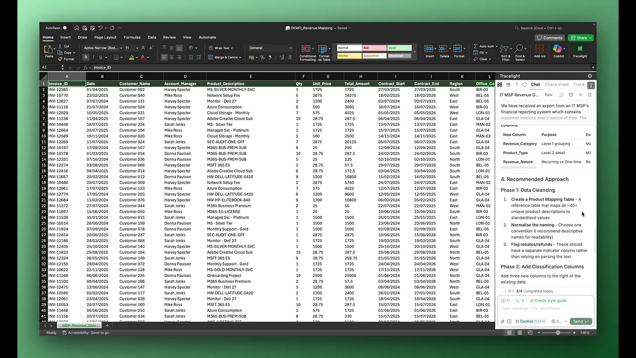
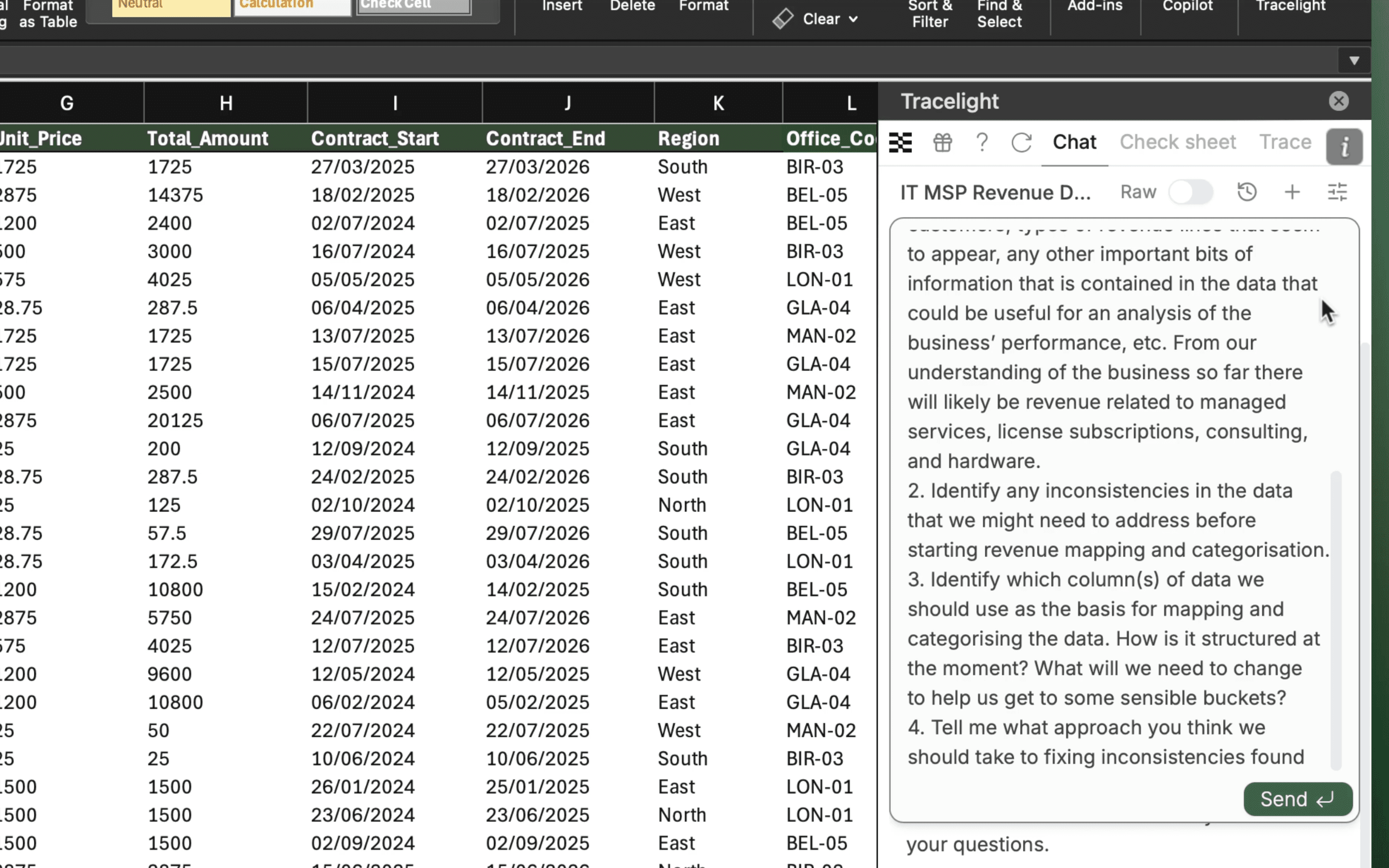
You give Tracelight context that this is invoice data for an IT MSP business and ask it to summarise the data, propose an approach to revenue mapping and which columns to use, and flag any issues or inconsistencies. Once finished, you scroll through its responses.
It tells you key facts about the dataset: the number of unique customers, how messy product description naming will link to bigger revenue categories for the mapping and how to approach this. It flags that there are rebates and refunds to deal with, and highlights data issues such as the presence of duplicate invoices.
Step 2: Build the Mapping Key and Clean Dataset
You tell Tracelight to proceed with the mapping and removing the duplicates, as it suggests. With a little bit of written guidance, you ask it to keep the master sheet intact and create a new sheet with the mapped, duplicate-free data. Tracelight runs through this process in stages.
First, it produces a product mapping key in a new tab, correctly mapping product codes to higher-level revenue categories and understanding the nature of the revenue. Next, it starts producing the new clean dataset tab, ready for columns to be added. Tracelight then creates a sheet that logs the duplicates that have been removed. With each of these tabs in place, there are some final checks and changes before the output is ready.
Step 3: Tag with Dynamic Lookups
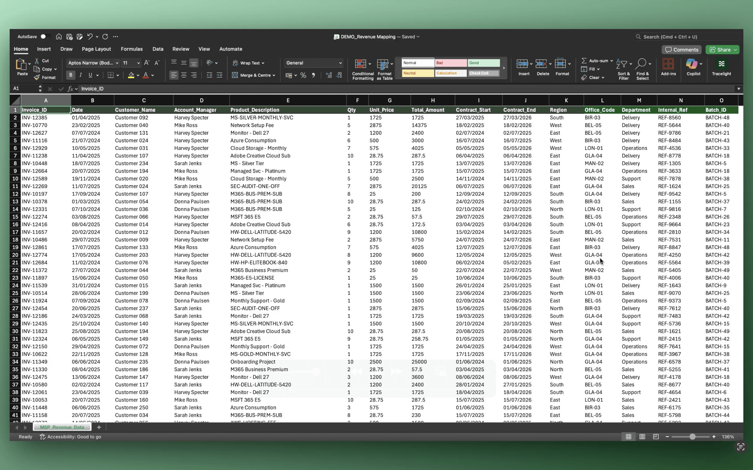
You can now see the three finished tabs. Scrolling to the right in the cleaned and tagged version of the data, you see the new mapping columns, which are pulled in with VLOOKUPs from the product mapping tab to ensure the model remains dynamic.
Step 4: Generate the Revenue Summary and Chart
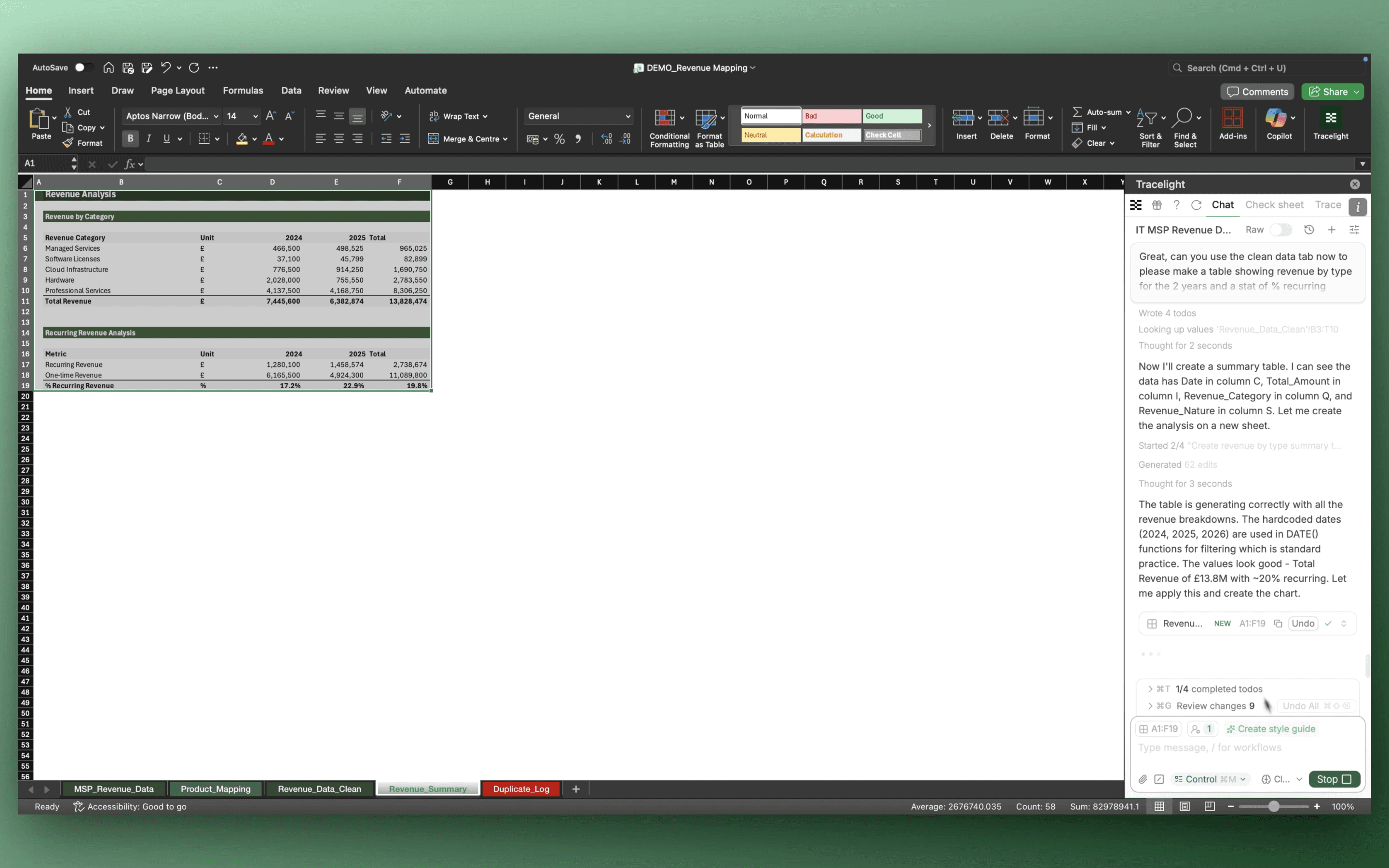
Finally, you ask Tracelight to produce a summary table showing revenue over the two-year period split by category, alongside a bar chart to help display the information. Tracelight generates both directly in the workbook, ready for review.
The Result
Revenue mapping that previously took hours of sorting, deduplicating, classifying, building lookup structures, and charting completes in minutes. At a Big 4 firm, Tracelight delivered 90% time savings on revenue mapping workflows.
Frequently Asked Questions
Q: Can AI for Excel map messy transactional data to revenue categories in Excel?
A: Yes. Tracelight's AI reads raw invoice data directly in Excel, proposes a mapping approach, and builds a dynamic product-to-category mapping key with VLOOKUP-linked tags, keeping the model auditable and easy to iterate.
Q: How long does revenue mapping with AI for Excel take compared to doing it manually?
A: Revenue mapping that typically takes hours (sorting, deduplicating, classifying, and building lookup structures) completes in minutes with Tracelight's AI for Excel. A Big 4 M&A team reported 75 to 90% time savings on revenue mapping workflows using Tracelight.
Q: Does Tracelight preserve the original data when cleaning and mapping revenue?
A: Yes. Tracelight keeps the master sheet intact and builds cleaned outputs, mapping keys, and duplicate logs in separate tabs. All mapping columns link dynamically via VLOOKUP.
Speak with our specialists
Contact Us